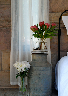
Sometimes design is all in the details...the way a book is perched, how you group a collection, what color the spine of a book is....Here's a collection of simple styling tricks you can use.

Isn't the layering of this art almost like a piece of art itself? Like the collection is more than the sum of the individual pieces.
Ok I'll never be able to afford the things in this bathroom but I can take a page out of the stylist's book. Here the water flows through the chandelier, and the pips are hidden in that wood box next to the (crazy!) tub
I like the mirror on the bulletin board. Also everything else about this space except the ugly carpet
Ideas to steal: curtain around crib, floor cushions make reading nook, DIY chandelier, branch as curtain rod, DIY bunting, perfectly distressed green dresser
I'm in love with this shot. Perfectly styled bench under perfectly styled gallery wall. Who needs a bookshelf when you've got this?
They've installed a faux-fireplace as a focal point. Glass instead of fireplace, rolls of paper instead of logs, wire tacked across the front for texture.
Everything about this space is perfect to me. Including that rug and the way this table becomes a desk for 2 due to the positioning of it
I like the curtain to separate the tub from the rest of the room. And, of course, the chandy and amazing antiqued glass.
This may be a little too deliberate for some, but I kind of like the surprise of having the photo under your coats and hats and little parts being alternately covered and revealed day by day.
And now for the ultimate example of the wonder of styling:


No comments:
Post a Comment