Adore Home just released their latest issue....here are a few images I found inspiring!

I love the eclectic mix of furniture here....none of it 'matches' but it all 'goes.' Probably because you're too busy focusing on the beautiful art and that electric-purple chair!

Loooove the purple pillows with black pom trim. Not what I usually am drawn to but here it's so fun! I also love how that fun vintage-y poster formed the color palette for the space!

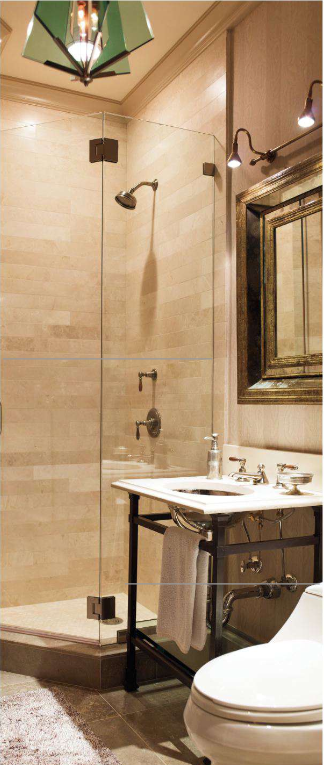
Last but certainly not least, I adore many aspects of this bathroom. I reeeeeeeally love the tile behind the sink--anyone know who makes that?? I also like the frameless glass enclosure and how the tile forms a little shelf behind the sink. Dislikes: the proportions of the room. That garden stool is massive! With a tiny-appearing plant! A smaller stool would have been better....but all in all I'd still move right in :)
Also, I know I'm behind the times, but the Spring 2012 issue of TradHome had too many goodies for me to just pass on by....here are my favorites:

I've been in love with this bird wallpaper ever since I spotted it in a 2009 issue of Instyle magazine....it was featured in Olivia Wilde's bedroom! (see below)


I also loved the mix of textures here...wood, metal, glass, painted canvas.

Although my own home has always been very colorful, more and more I'm drawn to neutral, textural spaces like this!

I love the custom 'banquet' here, although I would have painted it white so it flowed more seamlessly into the rest of the kitchen. The exposed beams are fantastic, and I love the color of grey they chose--grey is tricky!!

I selected this image because it's very similar to what we will be doing for the fireplace at my boyfriend's house....contrast tile about a foot around the fireplace, the rest a dark grey, and a simple wood beam mantle with TV over it. Love this!

Although, hmmm, maybe we need to add some chunky corbels to the mantel.... I like this look a lot too!

There is such clever use of space here--built-in storage below the bed and tucked into a nook beside the bed, plus a sconce for nighttime reading!

I also love the space planning here. The middle island serves as a bookshelf on the living room side, banquet on the kitchen side, and keeps the plan open but still with distinct zones. Genius.
The use of frameless glass shower enclosure here makes the small bathroom surprisingly grandiose.

I looooove the interplay of colors here!

In another genius budget move, these homeowners used a (likely more expensive) tile as an accent feature in the shower with inexpensive subway tile everywhere else. Adding a garden stool makes the shower seem like it's own little room!

Here's a great way to up the excitement factor for a simple chair...just add a thick ribbon under a thinner ribbon.

Fairly neutral, but amazing texture...the eye doesn't get bored.

I love the idea of using a pricier tile as an accent in the shower. Totally wish I would've thought of that when we redid our bathroom two summers ago. I just stuck with white subway tile and gray grout. So innovative. ;)
ReplyDeletehaha, well there's a reason white subway tile is always classic! I'm a big fan of your home, I'm sure it's beautiful :)
ReplyDelete