Monday, 11 June 2012

Obsess/Possess: Crystal Gentilello's Bedroom

Next up for Obsess/Possess? Crystal Gentilello's bedroom as seen on her portfolio and The Everygirl (both great sources of inspiration!)

OBSESS:


The minute I saw this beautiful bedroom I was blown away by the talent it took to compile such a neutral, deceptively simple bedroom.  While I can attempt to replicate it, I wanted to take a minute to acknowledge the skill it took to be the original!


That being said....I still did my job.  Here's my version: 

POSSESS: 


All sources can be found here, but I want to highlight some stars of this board. The Director's side table is from Target--fifty dollars! I also really liked the dresser, which was found for $150 at Shopko! Mixed with other pieces from various places, sometime big-box purchases fit in nicely. Another star of Crystal's bedroom is obviously her (I'm assuming vintage) wall sculpture.  Similar ones can be found on ebay or etsy by searching things like "brass flower wall" "metal sculpture""Hollywood regency sculpture" etc. 

To me, though, the best part of this room is the wall color...the hint of pink is just so fantastic. My version is Benjamin Moore's Pensacola Pink.

Also, as I was coming up with this post, I found several pieces that, if it were me, I would replace in that room for a little added polish/interest. 
Crappy photo quality, but I love this little director's table a bit better than just the side table.  For only ten more dollars, you get a little more storage space and visual weight.

I think this Pier 1 mirror would up the girly ante even more. So lovely, and on sale for $200! Well worth it in my book.


Like what you see? Find other Obsess/Possess posts here.

I've got a gripe about Lonny

Ok.  Usually I love Lonny and have drawn tonnnns of inspiration from it in the past.  However, this month's (June-July) issue was a drastic divergence from what I've come to know and love.  Is it just me, or was Lonny overly, pretentiously....douchey this month?!

I felt that the copy was snobby and forced, and the bazillion-page spread on the Dransfield/Ross house was A) overly long and B) not really that great.  In fact, several of the images I found downright ugly.  Let's take a look:


The biggest offender: This bathroom. Hunter green, plaid, and dated florals.....it's like the early nineties came back in full force.  For how much money these people obviously have (albino peacock?! SERIOUSLY?!), I think this just shows that money can't buy good taste.

Copy gripe: This caption goes on and on about the fabulous 'glass-bead chandelier' that 'illuminates the space while providing its focal point.'  If it's so GD fantastic why don't you edit the photo so your viewers can gaze upon its splendor?!

Loved the 'favorite summer pastimes.'  They managed to be 'accessible' (tubing down the Delaware) while simultaneously proclaiming "I'm fantastically, atrociously, offensively rich, bitches!" (helicopter hop-scotching.  Seriously.)


 Another copy gripe: No, you did not magically happen upon Julia Leach in a 'moment of repose.' That shot was extremely calculated and she looks not reposed but constipated, probably from how forced the shot is.  However, I did like her place the best so it's not her fault the copy editors did a bad job. Beautiful chairs, Julia.


This also cracked me up....the 'texture'-added element of this room, white-washing the shades, is my least favorite thing about the room. And neutrals/seagrass in a summer seaside home? You don't say. This isn't terribly executed, nor is it groundbreaking.  I do however love the skull trash basket, simply because it makes the room less stiff/overly calculated to me. 


Lest I leave you thinking I'm a Debbie Downer today, I want to leave you with this beauty from the Dransfield/Ross home:
I find this lovely. The charcoal grey is beautiful, love the black/white staircase, don't love the beige runner but hey can't win them all, and I really like the arched doorway.

I guess my point in this whole gripe is that Lonny was created by former Domino editor Michelle Adams.  What I loved about Domino (RIP) was its accessibility and invariably good taste; what I hated about this issue of Lonny is that it came across extremely pretentious and of very questionable taste.  Please Michelle, come back to your roots (or bring back Domino! Can I get an Amen?!)


Sunday, 10 June 2012

Moodboard: Bf's Bathroom

My boyfriend recently had the good/bad luck of having his basement (including two of the four bedrooms) flood as a result of a backed-up pipe (no sewage water, luckily!). Bad because, well, it flooded, but good because home insurance is covering the damage! Meaning I get to play around with lots of ideas for the basement.  We've already painted the main room and fireplace (photos to come soon!), but today I was perusing the work of one of my absolute favorite artists, Clare Elsaesser.


I first became obsessed with her when I bought one of her prints as a first anniversary gift for my boyfriend:


Isn't it sweet??


As I clicked through her available selection, I noticed these three beauties:


And I thought to myself, "These would be perfect in my bf's small bathroom! I should make a moodboard to show him!" (because, of course, he loves lovingly tolerates that shit). So I did.  See?


All sources can be found here. Stars of this budget moodboard include the three prints (of course) but also the $40 IKEA shelving unit, $14 (!!?!) pendant lights (only I'd paint them dark grey, I think), and the West Elm striped towels ($10). I also looooove the variation of the penny tile, and I'd use white subway tile halfway up the wall, with Valspar's "Courtyard" at half strength on the top half of the walls. Then you know I'd get my stylin' on on top of the toilet, as shown, plus lots of little baskets and pottery to hide our ugly bathroom necessities.

Now, I know right away I won't be able to sell my bf on this plan, because a) he already told me he doesn't like penny tile (blasphemy!) or subway tile (gasp!) as it reminds him of crappy college bathrooms (ok, I guess I get his point....but has he SEEN this penny tile?!?!). However, I'm really hoping he'll go for the paintings, as I love this trio together and if he doesn't I may cry break up with him beg one of my readers to do this and send me pictures so I can live vicariously through him/her.

So what about you, lovelies? Any tips on how to make your significant other make the right choice and carry out the beautiful things you dream up in your heads even if it IS his house and he generally has really good style for how he upgrades things??

Saturday, 9 June 2012

Obsess/Posess: Kerrisdale Design

I've decided to start a new column on my blog entitled "Obsess/Possess" in which I present an image I've been drooling over and a budget-friendly way to achieve the same look.

OBSESS:
First up: This beautiful bedroom by the geniuses at Kerrisdale Design. I've long loved it for the perfect mix of masculine/feminine, plus the soft hues (grey stripes instead of the typical black, for example).


POSSESS:
Here's how I would achieve the same idea, on a budget:
1. West Elm sheets and duvet (both are on sale right now even!)


2. This Tonic Living pillow (look familiar? It's cuz I've posted about it a million times...because I love it)


 3. This task lamp from Home Depot (no, it's not a perfect match, but it is budget-friendly and decent on the eyes):

Or for a more perfect (but twice as expensive) alternative: This work lamp from IKEA:


4. This jute rug from West Elm in Flax.


I also like this chevron-esque one for a little more pattern.


5. These simple curtains from IKEA.  I like the tie-backs on these, and while they aren't pinch-pleat I think they still look clean and simple.


6. Round mirror--I would just go to etsy.com and search "round mirror" "porthouse mirror" or "convex mirror."  I found tons of options!


Now comes my favorite part of any good budget design: the DIY projects.
1. Bedside tables: I'd hack the good ol' Rast (basing it off this genius hack--I love that she added a toe kick and trim to the drawer faces to dress it up a little).  

For those less inclined to get their painting on, the Hemnes would work too (for about double the cost, once you take into account paint and supplies for the Rast).
2. Headboard: Use this fabric ($7.50/yd!) and this tutorial. Use tack strips, not individual nailheads.

3. Artwork: scour Vintageprintable.com for your favorite botanical images, print at Kinko's, and pop into cheapo black Michael's frames. Voila!
My four favorites are the Passion Flower (perfect for a bedroom, no? ;) Orchid, Wild Pansies, and la flor des environs de Paris

(Note: I'm omitting the bench, mostly because I feel like they are an affectation---like, really, you couldn't just sit on the edge of the bed?!  I agree they make a room look more 'finished' sometimes but they just bug me personally...and I think they are a prime example of over-propping.)

So what do you think? Budget-friendly and still a great approximation, or budget-friendly that looks budget-friendly (aka cheap)?


Next up?  Crystal Gentilello's beautiful bedroom as published in Rue magazine!


Friday, 8 June 2012

My Home Tour

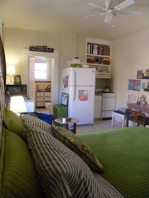
As my time in my sweet little studio comes to a close, I realize I haven't posted any pictures of it in a long time.  These are photos I took when I applied for (and didn't get accepted by) Apartment Therapy's Small Cool contest (probably largely due to my shitty camera....ugh). Anyway, since AT didn't want to share them, I will!


Come on in!  From the front door you can see pretty much my entire living space--it's tiny!

Front and center I have my favorite consignment find of all time, the Moroccan-y folding table base/tray top that I refinished. Also pictured is one of the blue chairs I scored on Clist ($75 for the pair!), a rug I bought in Chile, the other side table which I also refinished in college, and the headboard my mom and I made right before I moved to Utah. That window is the only one in the living area but it shed great light!

Here's a (even more) terrible photo but it shows the pretty details of the base a little better :) Here you can see the beautiful embroidered flower pillow, a memento from my time in Chile, and a painting I made of Chile (blue, top right). 
 

In this shot, I stood literally inside my closet behind my bed (see above photo). I think it gives you a pretty good perspective of my home. Front door to the right with the other blue chair, bathroom through the visible door on the left.  Kitchen sink is to the left of the bathroom door, you can hardly see it.


Here's the front door from the first shot. Do you get a feel for the layout?  245 square feet, but it treated me really well and I rarely felt cramped :)

My vintage-y bathroom with the black/white Draper-inspired dresser, which I also refinished myself. Sink to the left of this shot, shower behind the wall on the left (to the left of the dresser--shower entrance is 90 degrees to the dresser).


And finally my little gallery wall area!  Full to the brim with photos of family/friends and mementos from my boyfriend. He made the colorful map on the lower left side for our 1 year anniversary! So sweet. Also pictured are the bench and chairs I refinished and my pretty desk from a consignment shop here in SLC--it was a housewarming gift from my parents :)

And that's pretty much it! It was tiny, but it was home.  All my favorite pieces will be transitioning into my boyfriend's uber-manly home, so it will be interesting to see how they transform.  First up, repainting my lavender desk--the bf is pretty lenient style-wise but drew the line at French lines PLUS lavender/purple paint with lucite knobs! :)

Friday, 1 June 2012

Adore Home mag

Adore Home just released their latest issue....here are a few images I found inspiring!
I love the eclectic mix of furniture here....none of it 'matches' but it all 'goes.' Probably because you're too busy focusing on the beautiful art and that electric-purple chair!

 Loooove the purple pillows with black pom trim.  Not what I usually am drawn to but here it's so fun! I also love how that fun vintage-y poster formed the color palette for the space!

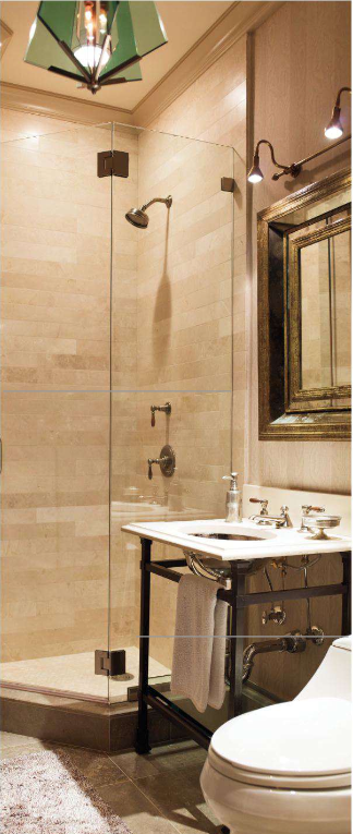
Last but certainly not least, I adore many aspects of this bathroom.  I reeeeeeeally love the tile behind the sink--anyone know who makes that?? I also like the frameless glass enclosure and how the tile forms a little shelf behind the sink.  Dislikes: the proportions of the room.  That garden stool is massive! With a tiny-appearing plant!  A smaller stool would have been better....but all in all I'd still move right in :)

Also, I know I'm behind the times, but the Spring 2012 issue of TradHome had too many goodies for me to just pass on by....here are my favorites:


I've been in love with this bird wallpaper ever since I spotted it in a 2009 issue of Instyle magazine....it was featured in Olivia Wilde's bedroom! (see below)


 I also loved the mix of textures here...wood, metal, glass, painted canvas.

 Although my own home has always been very colorful, more and more I'm drawn to neutral, textural spaces like this! 

 I love the custom 'banquet' here, although I would have painted it white so it flowed more seamlessly into the rest of the kitchen. The exposed beams are fantastic, and I love the color of grey they chose--grey is tricky!!

 I selected this image because it's very similar to what we will be doing for the fireplace at my boyfriend's house....contrast tile about a foot around the fireplace, the rest a dark grey, and a simple wood beam mantle with TV over it.  Love this!

 Although, hmmm, maybe we need to add some chunky corbels to the mantel.... I like this look a lot too!

 There is such clever use of space here--built-in storage below the bed and tucked into a nook beside the bed, plus a sconce for nighttime reading!

 I also love the space planning here.  The middle island serves as a bookshelf on the living room side, banquet on the kitchen side, and keeps the plan open but still with distinct zones.  Genius.

 The use of frameless glass shower enclosure here makes the small bathroom surprisingly grandiose.

 I looooove the interplay of colors here!

 In another genius budget move, these homeowners used a (likely more expensive) tile as an accent feature in the shower with inexpensive subway tile everywhere else. Adding a garden stool makes the shower seem like it's own little room!

 Here's a great way to up the excitement factor for a simple chair...just add a thick ribbon under a thinner ribbon.

Fairly neutral, but amazing texture...the eye doesn't get bored.


 So what do you think?  Any favorites I missed?